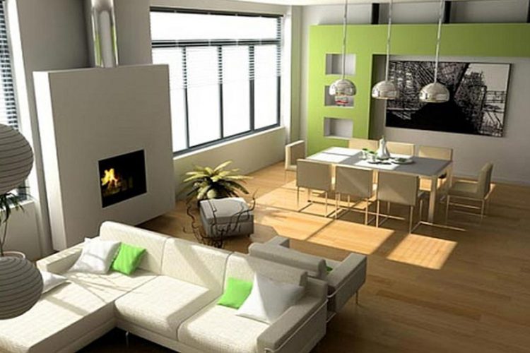
Many interior designers such as Sam Sorgiovanni, love the minimalist look and it certainly makes small spaces look larger if you don’t overcrowd them. But even the look of a large room can be spoiled when it contains too much ‘stuff’, being reminiscent of an overcrowded shop. You can’t appreciate the interior design because there is just too much to see.
Here are 7 secrets from mcmcabinets.com.au to a minimal interior design.
- Balance and proportions are key elements to a minimalistic look. Nothing, especially the furniture, should look too big or too small for the size of the room. Don’t put more on one side of the room than the other or it will look unbalanced and uneven. Furnishings should complement and coordinate together – which doesn’t mean you can’t use accent colours.
- Consider quality over quantity. Don’t just choose things from a catalogue. What is in a minimalist room will really stand out and become a focal point, so it needs to be at least uncommon, if not unique. If it is just ordinary, the room will look kind of blah.
- The delight is in the details. Just because a room is minimalist style doesn’t mean it can’t have details – just not too many of them. And what there are need to be delightful, interesting, fun or dramatic in some way. Examples? A picture frame with gold leaf edge or some other design on it; embroidery on a cushion, unusual texture of some kind, either in the carpet, artwork or a decorative panel.
- Neutral or earth tones for the background colours of floor, walls, ceilings and major furniture make a minimalist space truly sophisticated and easy to be in. But add small accent colours in just some of the soft furnishings to avoid boring and bland.
- Lighting plays an important part. Don’t forget there will be two kinds; natural and artificial. Making the most of natural light is great for daytime use, but when night falls the right lighting can make any room pop and it is of great importance for one that is minimalist in design. Choosing just one spectacular light source is better than having three or four.
- Even floor coverings can make a room look smaller and more crowded. Make sure if you have a carpet or rug that it goes right to the walls.
- There is a fine line between minimalist and stark. You don’t want a room to look bare and stark, rather it should be welcoming; just not crowded with lots of things that are not needed. Walls are more visible once the room is in minimalist mode so a nice piece of art there will help prevent that unnatural, stark look.

